After I saw a talk about Android Jetpack Compose on Google IO 2019, I wanted to try it right away. Moreover, the approach implemented in it very much reminded Flutter, which I was interested in earlier .

The Compose library itself is in the pre-alpha stage, so not many documentation and articles about it are available. Next, I will rely on several resources that I managed to find, plus the open source library .
These resources are:
- Android Developers Backstage: Episode 115: Jetpack Compose
- Compose from first principles
- Diving into jetpack compose
What is Android Jetpack Compose?
Previously, the entire Android UI was based on the View class. This has been the case since the early days of Android. And in connection with this, many legacy and architectural flaws have accumulated, which could be improved. But to do this is quite difficult without breaking all the code written on their basis.
Over the past years, many new concepts have appeared in the world of client applications (including Frontend trends), so the Google team has taken a radical path and rewrote the entire UI level in Android from scratch. So the Android Jetpack Compose library appeared, which includes conceptual tricks from React, Litho, Vue, Flutter and many others.
Let's go over some of the features of the existing UI and compare it with Compose.
1. Independence from Android releases
The existing UI is closely related to the platform. When the first components of Material Design appeared, they worked only with Android 5 (API21) and higher. To work on older versions of the system, you must use the Support Library.
Compose is part of Jetpack, which makes it independent of the system versions and possible to use even in older versions of Android (at least with API21).
2. The whole Kotlin API
Previously, you had to deal with different files to make a UI. We described the markup in xml, and then used the Java / Kotlin code to make it work. Then we again returned to other xml files in order to set the themes, animation, navigation, ... And even tried to write code in xml (Data Binding).
Using Kotlin allows you to write declarative-style UIs directly in code instead of xml.
3. Composable = Composite: using composition instead of inheritance
Creating custom UI elements can be rather cumbersome. We need to inherit from View or its descendant and take care of many important properties before it gets started properly. For example, the TextView class contains about 30 thousand lines of Java code. This is due to the fact that it contains a lot of unnecessary logic within itself that is inherited by descendant elements.
Compose came up on the other hand, replacing inheritance with composition.
Padding is the best way to illustrate what it is about:
In the existing UI, in order to render the TextView indented at 30dp :

we need to write the following code:
<TextView android:id="@+id/simpleTextView" android:layout_width="wrap_content" android:layout_height="wrap_content" android:background="@color/cyan" android:padding="30dp" <------------------------ NOTE THIS android:text="Drag or tap on the seek bar" /> This means that somewhere inside TextView.java or its superclasses there is logic that knows how to count and draw indents.
Let's see how you can do the same in Compose:
// note: the cyan background color is omitted for now to keep it simple Padding(30.dp) { Text("Drag or tap on the seek bar") } Changes
TextView become just Text() . The android:padding property has turned into Padding , which wraps Text .
Benefits
Thus, Text is only responsible for rendering the text itself. He does not know how to count indents. Padding , on the other hand, is only responsible for padding and nothing more. It can be used around any other element.
4. Unidirectional data stream
Unidirectional data flow is an important concept if we talk, for example, about controlling the state of a CheckBox in an existing UI system. When the user taps on the CheckBox , its state becomes checked = true : the class updates the View state and calls a callback from the code that monitors the state change.
Then in the code itself, for example, in ViewModel , you need to update the corresponding state variable. You now have two copies of the pressed state that can create problems. For example, changing the value of the state variable inside the ViewModel will cause the CheckBox update, which may end in an endless loop. To avoid this, we will have to come up with some kind of crutch.
Using Compose will help to solve these problems, since it is based on the principle of one-pointedness. The state change will be processed inside the framework: we just give the data model inward. In addition, the component in Compose now does not change its state on its own. Instead, it only calls callback, and now it's the task of the application to change the UI.
5. Improving debugging
Since the entire UI is now written in Kotlin, you can now debug the UI. I did not try it myself, but in the podcast they said that debugger and breakpoints work in Compose.
Enough words, show the code
I know, I want to quickly see what the UI looks like in the code (spoiler: very similar to Flutter if you tried to write on it).
We'll start by creating some simple View , then compare how they look in the existing UI and in Compose.
1. FrameLayout vs Wrap + Padding + Background
We reuse our example above and try to make this TextView indented at 30dp with a turquoise background:
Existing UI:
<TextView android:id="@+id/simpleTextView" android:layout_width="wrap_content" android:layout_height="wrap_content" android:background="@color/cyan" <-------------- NOTE THIS android:padding="30dp" <------------------------ AND THIS android:text="Drag or tap on the seek bar" /> Now look at the code that does the same in Compose:
@Composable fun MyText() { Wrap { Padding(30.dp) { DrawRectangle(color = Color.Cyan) Text("Drag or tap on the seek bar") } } } Here are a few new things. Since Text only knows about rendering text, it doesn't care about padding and background. Therefore, to add them, we need to use three separate functions:
-
DrawRectanglebackground -
Paddingindents -
Wrapis a function that overlays parameters likeFrameLayout.
Easy. But it’s slightly different from the existing UI system that we are all used to.
2. Vertical LinearLayout vs Column
Now let's try to do something equivalent to our good old LinearLayout .
To place two elements one below the other, as in the picture below, we can use Column :

The code will look like this:
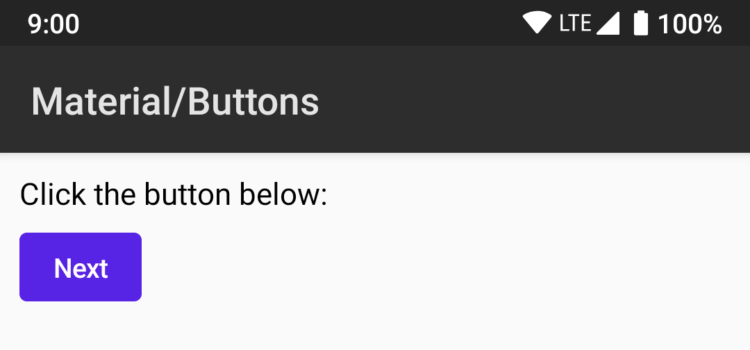
@Composable fun FormDemo() { Column(crossAxisAlignment = CrossAxisAlignment.Start) { Text("Click the button below: ") Button(text = "Next") } } The elements nested in the Column will be located vertically one below the other.
2a. Indentation
You probably noticed that the text and button are too close to the edge. Therefore, add Padding .
@Composable fun FormDemo() { Padding(10.dp) { // Column(crossAxisAlignment = CrossAxisAlignment.Start) { Text("Click the button below: ") Button(text = "Next") } } } It looks better:

2b. Intervals
We can also add some indentation between Text and Button :
@Composable fun FormDemo() { Padding(10.dp) { Column(crossAxisAlignment = CrossAxisAlignment.Start) { Text("Click the button below: ") HeightSpacer(10.dp) // Button(text = "Next") } } } What our screen looks like now:
2c. Horizontal LinearLayout vs Row
Place the second button next to the first:
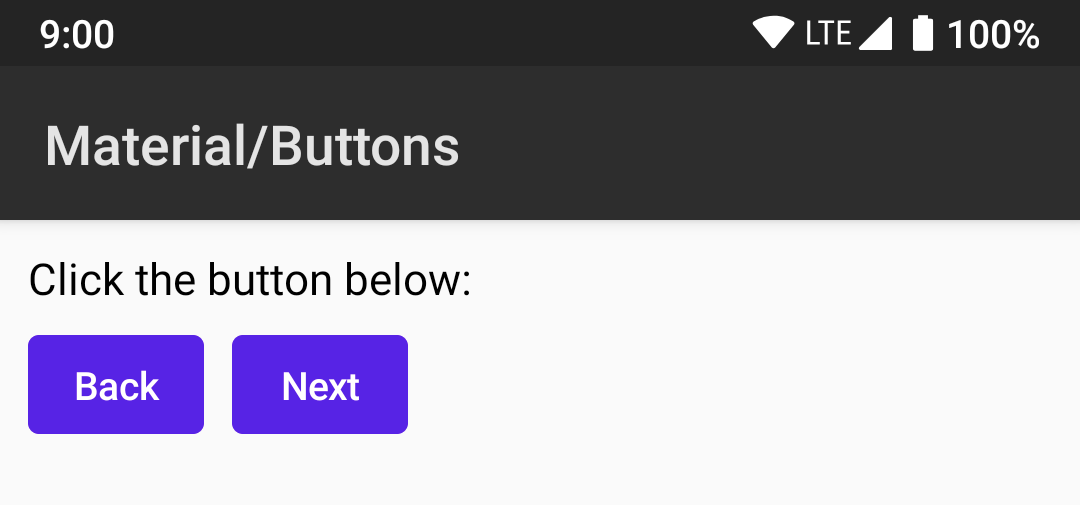
Code for this:
@Composable fun FormDemo() { Padding(10.dp) { Column(crossAxisAlignment = CrossAxisAlignment.Start) { Text("Click the button below: ") HeightSpacer(10.dp) Row { // Button(text = "Back") // WidthSpacer(10.dp) // Button(text = "Next") } } } } Inside the Row two buttons will be horizontal. WidthSpacer adds the distance between them.
2d. Gravity vs Alignment
Align our elements in the center, as gravity does in the current UI. To show diff, I will comment out the old lines and replace them with new ones:
@Composable fun FormDemo() { Padding(10.dp) { // Column(crossAxisAlignment = CrossAxisAlignment.Start) { Column(crossAxisAlignment = CrossAxisAlignment.Center) { // Text("Click the button below: ") HeightSpacer(10.dp) // Row { Row(mainAxisSize = FlexSize.Min) { // Button(text = "Back") WidthSpacer(10.dp) Button(text = "Next") } } } } We will succeed:

With crossAxisAlignment = CrossAxisAlignment.Center nested elements will be horizontally centered. We should also set the Row parameter mainAxisSize = FlexSize.Min , similar in behavior to layout_width = wrap_content , so that it does not stretch across the screen due to the default mainAxisSize = FlexSize.Max , which behaves like layout_width = match_parent .
2d. Comment
From what we saw in the examples above, you can see that all elements are built in composite from separate functions: padding is a separate function, spacer is a separate function, instead of being properties inside Text , Button or Column .
More complex elements such as RecyclerView or ConstraintLayout are under development: therefore, I could not find an example with them in the demo sources.
3. Styles and Themes
You probably noticed that the buttons above are purple by default. This is because they use default styles. Let's see how styles work in Compose.
In the examples above, FormDemo tagged with @Composable annotation. Now I will show how this element is used in Activity :
override fun onCreate(savedInstanceState: Bundle?) { super.onCreate(savedInstanceState) setContent { CraneWrapper{ MaterialTheme { FormDemo() } } } } Instead of the setContentView() function, we use setContent() , an extension function from the Compose.kt library.
CraneWrapper contains the Compose tree and provides access to Context , Density , FocusManager and TextInputService .
MaterialTheme allows you to customize the theme for elements.
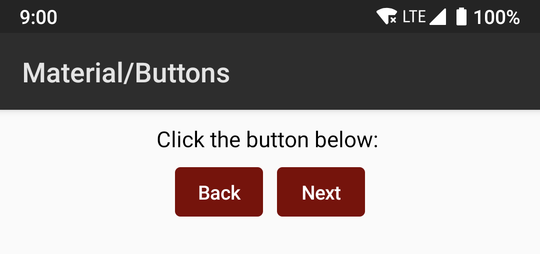
For example, I can change the primary color of the theme to brown as follows:
override fun onCreate(savedInstanceState: Bundle?) { super.onCreate(savedInstanceState) setContent { CraneWrapper{ // MaterialTheme { MaterialTheme(colors = MaterialColors(primary = Color.Maroon)) { FormDemo() } } } } Now our screen will look like this:
Other colors and fonts that can be changed: MaterialTheme.kt # 57
Rally Activity provides a good example of how to customize a topic: source code to RallyTheme.kt
What to see / read
If you want more, you can assemble the sample project according to the instructions here .
As Windows users write, now there is no official way to launch Compose, but there is an unofficial guide from kotlinlang Slack .
Questions about Compose can be asked to developers in the channel #compose kotlinlang Slack.
Leave other links in the comments - the most useful ones will be added here.
findings
The development of this library is in full swing, so any interfaces shown here are subject to change. There are still many things that you can learn about in the source code, such as @Model and Unidirectional data flow (unidirectional data stream). Perhaps this is a topic for future articles.
More posts:
All Posts